
















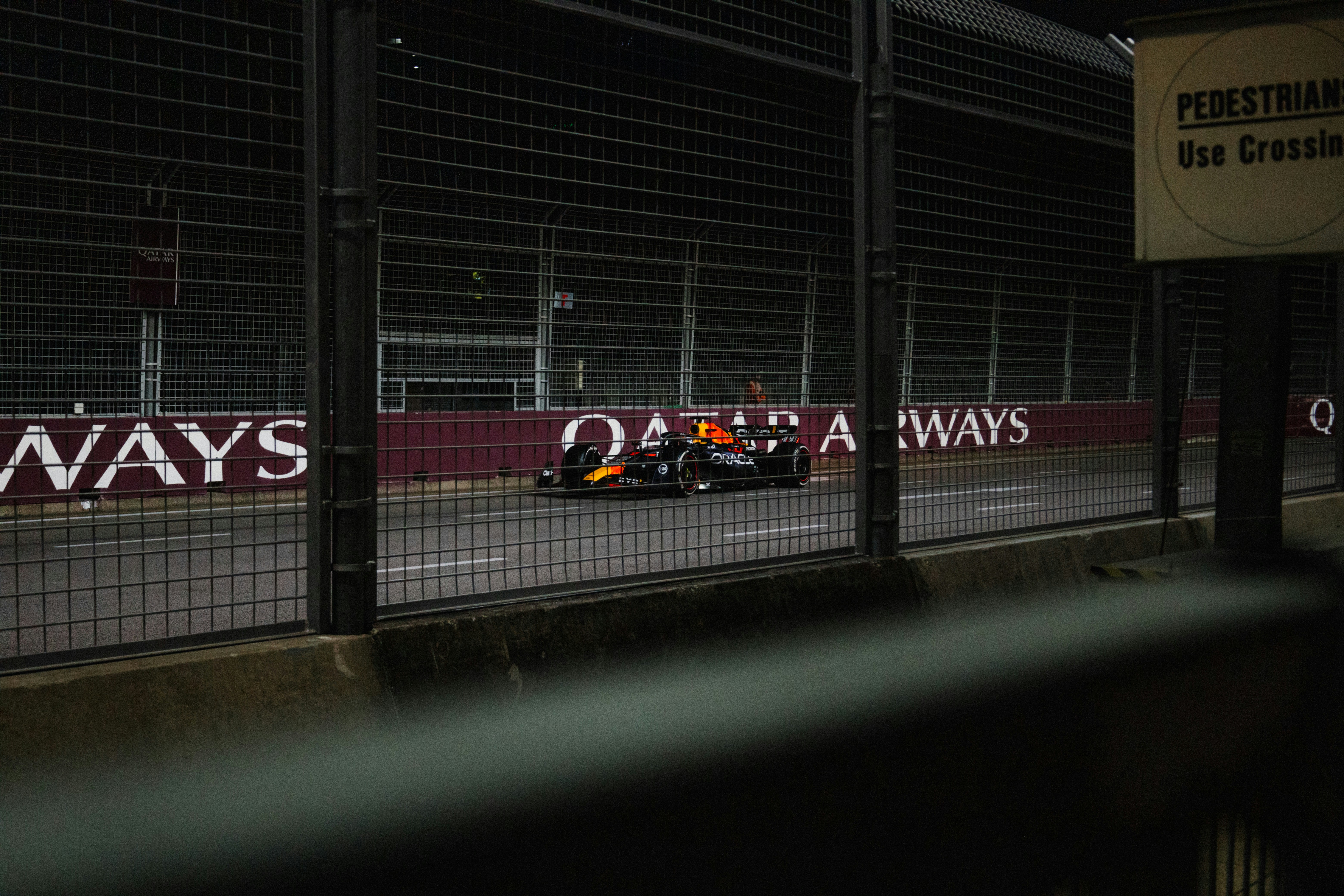
Every Formula 1 statistic in one place.

FiDB is the F1 database in your pocket: the current season and the upcoming races, but above all the history of the sport. Past races, old seasons and complete careers are easy to look up.

For it, the founder collected Formula 1 data for more than thirty years, including from yearbooks going back to 1960, and turned it all into a single database, with all the timings.

Respectful of the past,

in line with what users

expect today.

The challenge

FiDB was born in a different era. It had a loyal group of Formula 1 followers and steady organic growth, but visually and structurally the app was still firmly rooted in the aesthetics of 2018.

On the iPad the experience was already strong, with extensive overview screens; on the iPhone the app still felt basic and dated. The task was to bring the iPhone app up to the same level without losing what loyal users value about FiDB.

30+

years of F1 data, collected by the founder

1960

the first yearbook processed into the database

The approach

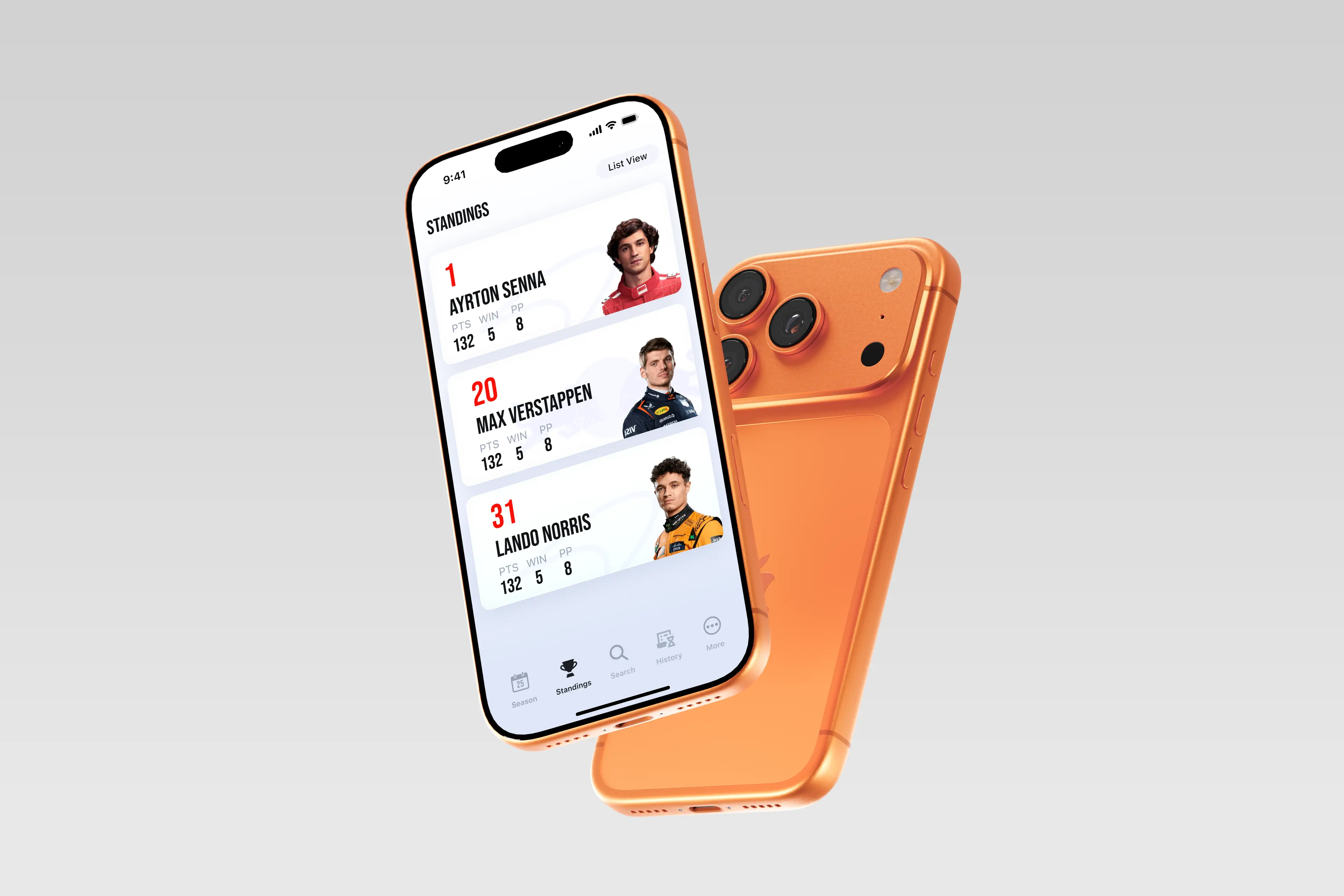
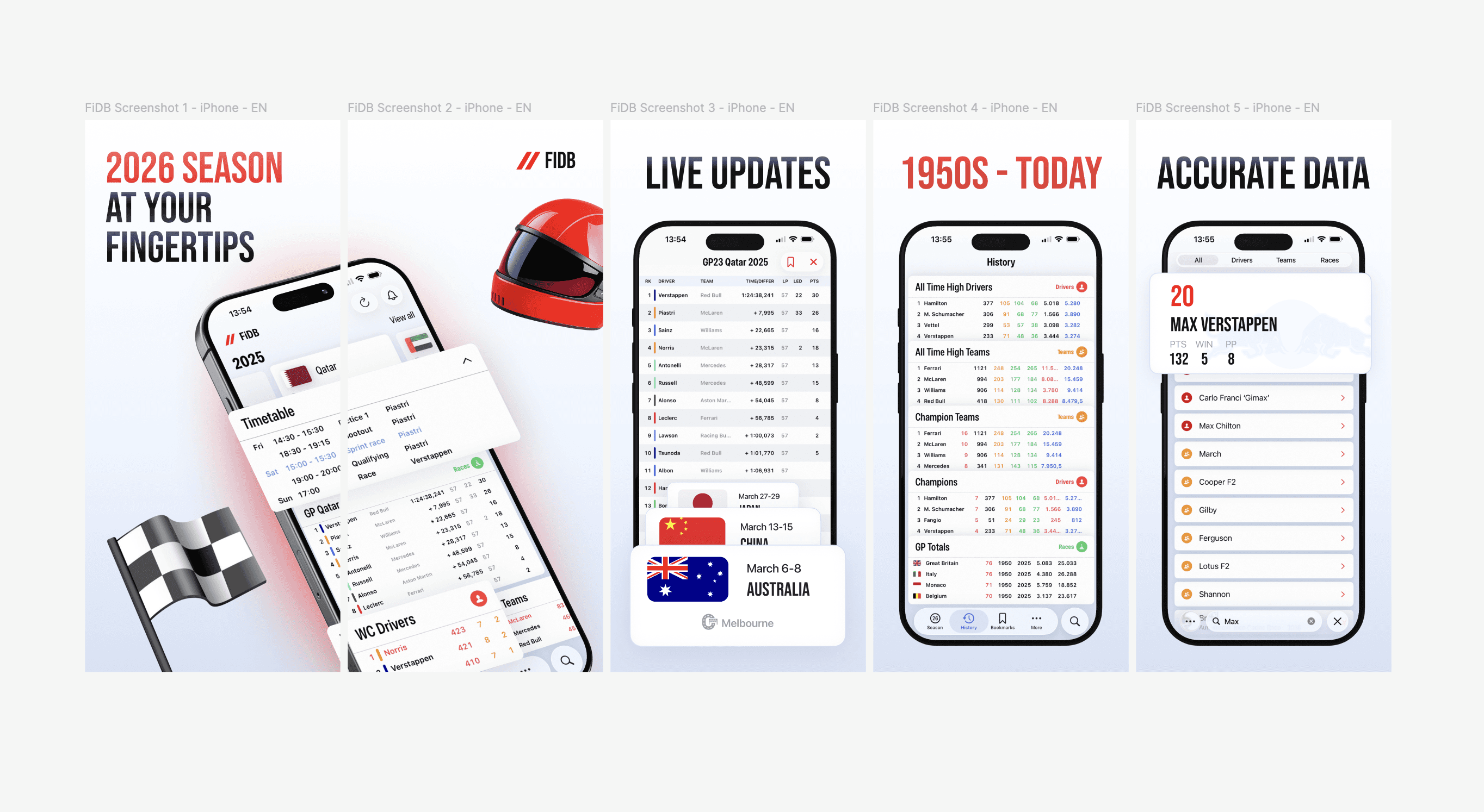
We analysed the entire architecture, refined the flows and, above all, gave the iPhone app a completely new design. The aim was not to reinvent the experience but to strip out unnecessary complexity, so users find what they came for faster.

We also built new features, such as a chart of the points progression through the season, so you can see how the standings looked at any moment. With a proof of concept for on-device AI, we also explored a dedicated assistant that answers questions about races, drivers and standings.

We tackled conversion too, and that took more than cosmetic changes. We restructured the information so the benefits became clearer and the move from the trial period felt less abrupt. Trust comes from transparency, predictability and visual consistency, not from a bigger button.

The result

The changes don’t shout, but they clearly move the product forward. FiDB has become more elegant, calmer and easier to understand: a new voice, without changing the heart of the app.

The difference is greatest on the iPhone. What used to be a stripped-down version of the iPad experience is now a fully fledged app: the same depth, but with a shorter route to the screen someone opens the app for.

What stayed is what it was all about: more than thirty years of collected data, from the yearbooks of 1960 onwards to last weekend’s race, in one app where you can actually find it.

More than sixty years of Formula 1, in one app.

An archive this size calls for restraint in the design. It wasn’t the app that had to impress, but what is in it.

Your F1 companion

Your F1 companion

FiDB was born in a different era. We saw a loyal group of Formula 1 followers, a dedicated user base and solid organic growth. At the same time, we noticed that visually and structurally the app was still firmly rooted in the aesthetics of 2018. We saw the potential, but also the need to renew the product — respectful of the past, but in line with today’s expectations. The existing functionality and loyal user base were our starting point.

FiDB was born in a different era. We saw a loyal group of Formula 1 followers, a dedicated user base and solid organic growth. At the same time, we noticed that visually and structurally the app was still firmly rooted in the aesthetics of 2018. We saw the potential, but also the need to renew the product — respectful of the past, but in line with today’s expectations. The existing functionality and loyal user base were our starting point.

2026

2026

Sharper and more confident

We analysed the entire architecture, refined flows and introduced visual patterns that feel more purposeful. Our aim was not to reinvent the experience, but to strip out unnecessary complexity and make it easier for users to find value. By improving existing elements and adding new ones, the app gained a clarity and confidence it lacked before.
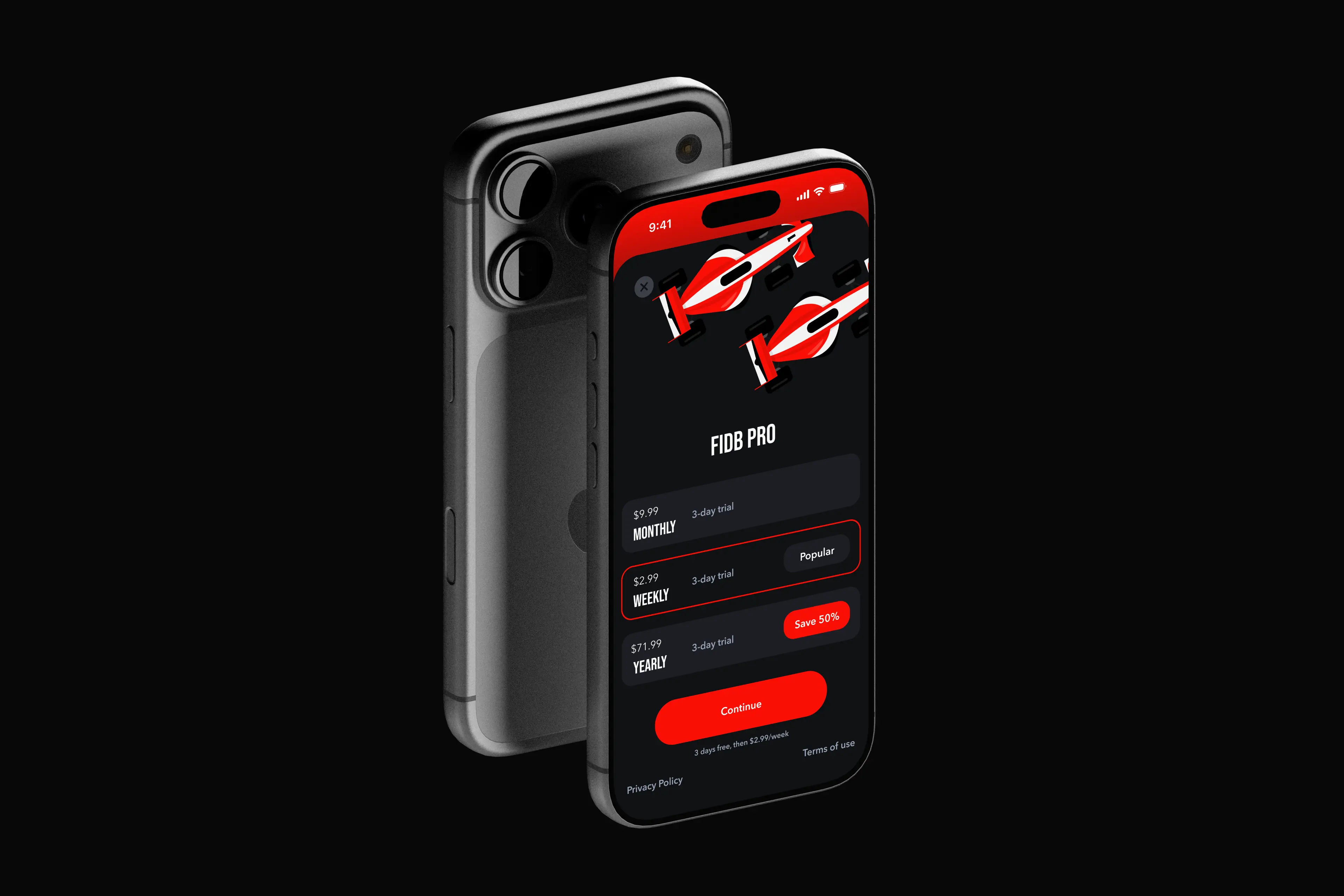
Design that supports conversion

Improving conversion took more than surface-level changes. We worked on building trust through transparency, predictability and visual consistency. Users convert when they feel a product understands them — and that is exactly the feeling we strengthened in the redesign. We restructured information so the benefits became clearer and the trial experience felt less abrupt.

A quiet improvement

The changes do not shout, but they clearly move the product forward. We made FiDB more elegant, calmer and easier to understand. In many ways we gave the product a new voice without changing its heart.
Ourtalented teamis ready to take on your challenge.

Our talented team is ready to take on your challenge.